Jack Lien and David Saffir, June 19-23, 2012
Early Bird registration, before May 1, 2012 is $650. After that, $795. Call Jack Lien (360) 481-4575
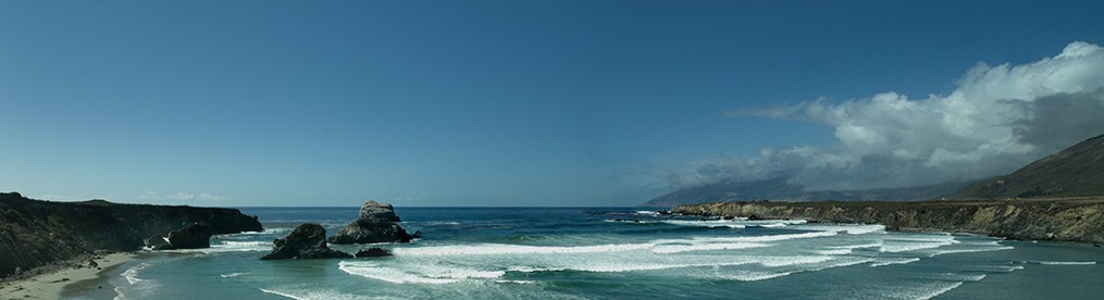
On a Palouse Country Photo Tour and Workshop, you’ll capture the uncommon photograph in a region described by National Geographic Magazine as “A Paradise called the Palouse.”

This 4,000 square-mile region sprawls across the Washington-Idaho border, encompassing uncommonly rich farmland. Crop patterns form a vibrant patchwork appearance and a wild sea-like wave as the winds cause fields of wheat and barley to bend and sway. The Palouse offers photographers the opportunity to capture a diverse landscape and a chance to witness an unforgettable land formed by the Lake Missoula glacial flood path of 15,000 years ago. Palouse Country Photo Tours is the only photography tour company that specializes in and is intimately knowledgeable with this amazing country.
This 5-day workshop, includes intensive field work, plus hands-on, practical, image-editing and printing instruction.

Field Work: Images From the Palouse
In the field portion of this photo workshop we will capture images of the rapidly developing stages of crop growth and farmers working the fields. This is an excellent time to photograph the deep rich green fields against the freshly plowed ground and the pastoral scenes only found on the Palouse. The bold colors, patterns, lines, and contrast against the contours of the Palouse landscape is breathtaking.
Field Workshop leader Jack Lien has lived on and photographed in the Palouse for over 40 years. He’s discovered countless photographic opportunities throughout the region and has gained access to private land, nostalgic buildings and landscape that are often unknown or off limits to others.
Jack will get you into the heart and soul of the land and its people and you’ll have abundant opportunities to photograph historic buildings, barns, windmills, and fields. He also knows where to catch the best light for every shooting situation. You will have the opportunity to meet and photograph area farmers preparing their equipment for a long day in the field.
Segment Two: “Make Your Images Sparkle From Start to Finish”
In these segments, you’ll learn to optimize camera setup, get the right color from your computer, and edit your images to give them the sparkle and depth they deserve! We’ll emphasize Photoshop, Lightroom, Camera RAW, and fine art printing in these sessions.

Workshop Leader: David Saffir is an internationally-recognized photographer and printmaker. The author of two books, he provides color and imaging consulting services to individuals and organizations worldwide. He is the author of Mastering Digital Color: A Photographer’s and Artist’s Guide to Controlling Color, published by Thomson/Cenlar. His second book, focused on his photography, is titled The Joy of Discovery, published in Spring 2009. Other publications include Rangefinder Magazine, Professional Photographer, Pro Photo West, Great Output, Digital Imaging Technology, and others.
www.davidsaffir.com
https://davidsaffir.wordpress.com
Details, Workshop Itinerary:
June 19
• 3pm – 4pm Orientation meeting
• 4pm – 5pm Briefing on camera settings for color and exposure before we head out into the field (handout included)
• 5pm – Head out into the field until dusk to photograph this incredible land and its endless photo opportunities
June 20, 21, 22
• Each morning we will depart from the motel at 4:30-5:30am and return around 11 am for a much needed rest.
• 2pm to 3pm – Review and critique of images shot in the morning (w/ David Saffir).
• 3pm return to the field and shoot until after sunset.
June 23
• 8 am to 12 noon – Classroom instruction, “Make Your Images Sparkle From Start to Finish” – David Saffir
Includes image editing and final critique of images captured during the week, plus printing.
Learn how to manage image quality from capture, to editing, and on to display or print. Get the most from your camera, computer, software, and printer, and create images that meet or exceed your expectations!
Agenda:
• Camera settings – white balance, ISO, shutter and aperture, color settings, JPEG vs RAW
• Review: Transferring and backing up images after the shoot.
• Organizing and selecting images for further processing and editing – including cataloguing and adding keywords for accessibility
• Setting up the computer and display for correct color
• Processing images in Camera RAW/Lightroom
• Image editing in Photoshop
• Printer setup and printing fine art images
WE WILL COLOR CALIBRATE ANY LAPTOP, COMPUTER, OR IPAD, FREE OF CHARGE, WHEN THE SEMINAR BEGINS.
____________________________________________________________________________
Limit 8 photographers – Workshop Fee: pay on or before April 1, $650, after that $795
Local transportation and lodging not included in fee
To register for this “Best of the Palouse Photo Tours and Workshop” go to our website at www.palousetours.com or contact us at: palousetours@comcast.net or call Jack Lien: (360) 481-4575
We suggest early registration as classes fill up quickly. A laptop is recommended but not required.